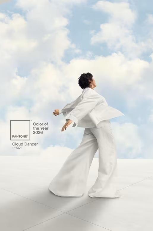
Hard to argue with Pantone’s Color of the Year choice for 2026. White. Certainly don’t want to go red or blue in the US these days. And most everyone has favorite or least favorite colors they can name, but white — er, “Cloud Dancer” aka Pantone 11-4201— likely won’t be prominent in either category.
On the other hand, I suppose one might say white is very political. In which case, not so correct.
Nevertheless, Pantone leads with “A lofty white whose aerated presence acts as a whisper of calm in a noisy world.” Perhaps. Perhaps not. I leave it to you to dive into their website and find all the purple prose that I have ridiculed in the past. I’m disinclined to do it all again.
Instead, I invite you to read The New York Times article “Pantone’s 2026 Color of the Year Is ‘Cloud Dancer.’” Their Styles Desk gives it more attention than I can muster. Examples:

HOLTERMANN This white, in particular, strikes me as a little flavorless. It’s the color of cottage cheese and dental floss, of marshmallows and AirPods. It reminds me of the clothes I put on when I’m in a rush and the foods I eat when I have a stomach ache.
GALLAGHER White, historically, has been worn to signal wealth. It showed you have the means to keep your clothes clean. Maybe this just foreshadows a massive year for stain removers. At the least, it is a bit elitist. But doesn’t that itself match the moment?
__________
Header: Screenshot from Pantone video
hmmm
I do think it beats many of the colors they’ve chosen in past years. But it seems like a punt rather than taking a chance and choosing a real color.
I follow their choices with interest – this one feels a bit iffy to me – it does seem to have the optimism of a blank page… or be about peace… but it also screams division to me (in a polarized that is so black and white, it feels un-accidental that they chose the white)… sigh. thanks for the post! Linda xx
Admittedly black would be seen as death and evil, despite also being very chic and formal. I’ve followed their choices for a long time too. This seems more like a non-choice, a reluctance to commit.
I agree – I wonder why they couldn’t have gone a “barely there blue” (but then again, just writing those words I could see how they could be hijacked) – what a world we live in that color can’t just be color anymore… but then again, it probably never was!
I suppose it’s just human nature that when you see a color you will associate it with something you know. Pantone probably hopes the association will be with something positive.
Here’s hoping – the world needs peace and tranquility these days! xox
I suppose it is better than picking the green or pink of the WICKED movie. But as a renter, white is in my face every day at home.
I get that. I’ve been a renter more than once. As for wicked green, I’m up to here with all things Wicked. And pink is generally just too girly for me.
I shy from having an opinion, especially regarding the political optics of this choice but my wife, a knitter/crocheter of 50+ years’ experience, reports that her friends and colleagues in the “fiber arts” world, are seriously disappointed.
I shouldn’t complain because I’ve been pretty meh about a lot of their choices in the past. But white just has zero personality and I can see how it wouldn’t be any fun at all for people in fiber arts or really any other creative endeavor.
When trying to match a paint color for a white wall in my 20-year-old house I was surprised to find it was nearly impossible without knowing the label on the original pain can. The men in the paint store laughed at me when I said I wanted a can of white wall paint. Sherwin-Williams lists a dozen kinds of “white” on their web site, including: alabaster, muslin, Greek villa, porcelain, and creamy. And, “neutral ground.” ??
Yep, you need either the precise name or the formula/recipe used for mixing a specific color. Recently I had both and it still didn’t match. As a child I was fascinated by all the colors, shades, names, etc. Started with the box of 64 (?) Crayolas. Graduated to tubes of watercolors, acrylics, oils. Then the specs used in printing/publishing.
I still have the chips for the paint colors I chose when I moved in here 20 years ago, and as I noted, a recent small touch-up didn’t match. I manage to ignore it … most of the time.
Well … once more I recall your tirade about the magenta that wasn’t, Colorado ! 🙂
And this, imnsho, is a white that isn’t. To me it looks kinda of worn. Old. Past caring. Very like myself, in fact … 😀
Most whites are actually very pale tints of one color or another, depending on what other colors will be around them. The whitest white I recall was among my oil paints decades ago … titanium white. But launch an internet search for “whitest white” and you’ll get dozens of answers.
I agree this one looks slightly grayish. But then again, that’s how it looks on my particular computer screen with my particular settings. Who knows what it really looks like.
I am so over Pantone…
They are rather full of themselves. I pity their staff writers who have to come up with all those overblown descriptions every year. But when a company’s only product is colors … whatcha gonna do? (And they were rather necessary during my years in print publishing.)